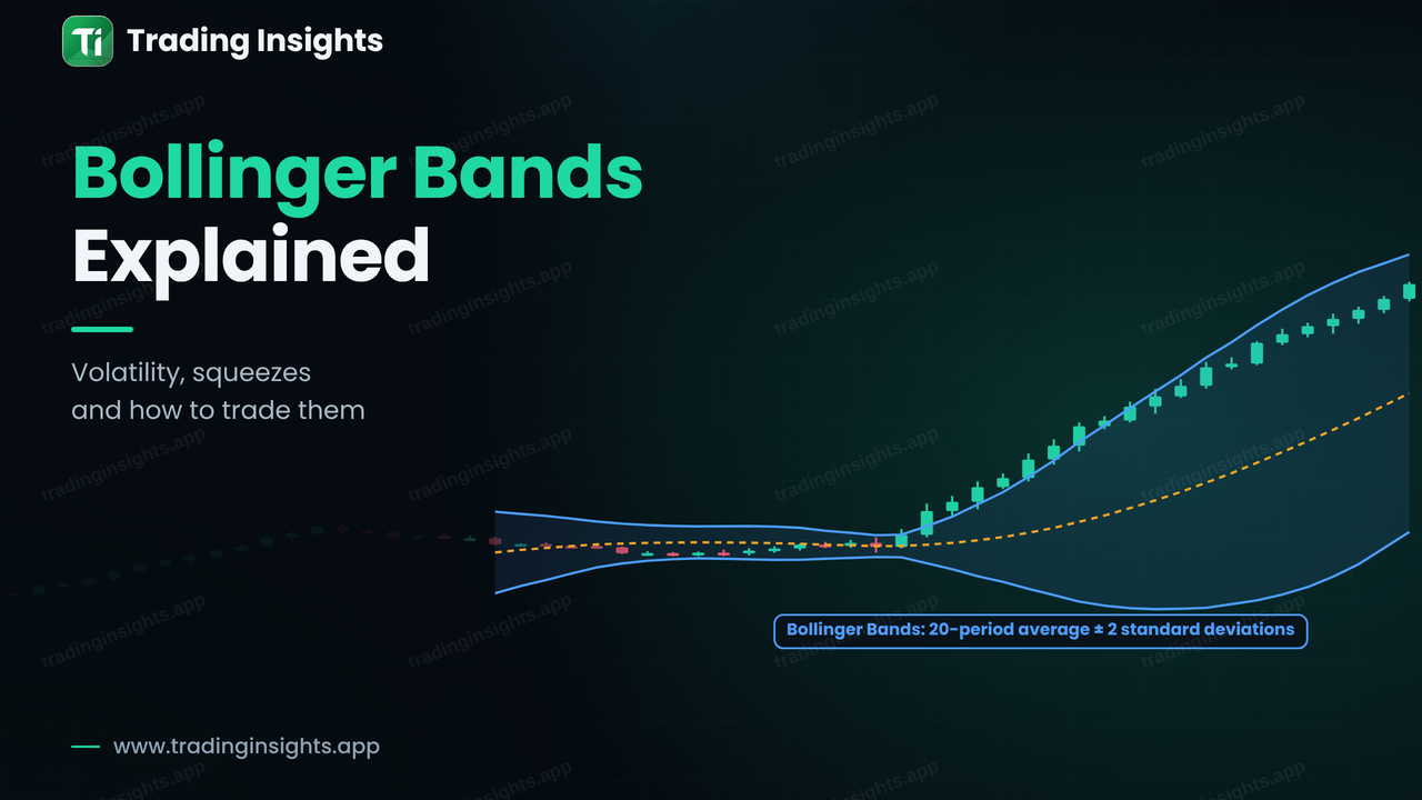
Bollinger Bands are a volatility indicator made of three lines drawn on the price chart: a middle line, which is a moving average, and an upper and a lower band placed a set distance above and below it. When the market is quiet, the bands move closer together. When the market becomes active, they spread apart. Traders use them to judge how volatile the market is, to spot a squeeze before a breakout, and to see whether price is stretched compared with its recent average. This guide explains how they are built, what the two most useful patterns mean, how to plan a breakout trade with a stop and a target, and where beginners go wrong.
How Bollinger Bands are built
The standard setting has three parts, and they were created by John Bollinger.
- Middle band: a 20-period simple moving average of the closing price. See moving averages explained for how it works.
- Upper band: the middle band plus 2 standard deviations of price over the same 20 periods.
- Lower band: the middle band minus 2 standard deviations.
Standard deviation is a measure of how far prices are spread out around their average. When prices swing widely, the standard deviation is large and the bands are far apart. When prices barely move, it is small and the bands squeeze together. Statistically, about 95% of closes fall inside bands set at 2 standard deviations when prices are roughly normally distributed, which is why a touch of the outer band feels unusual. Markets are not perfectly normal, however, so price can and does stay outside the bands, and this is the first thing to understand.
The squeeze and the expansion
Volatility tends to come in cycles: quiet periods are followed by active ones, and the bands show this. A squeeze happens when the bands are the narrowest they have been for a while. It does not tell you which way price will break, only that the market is storing energy and that a larger move is more likely than usual. The expansion is the other side: the bands widen as price breaks away.
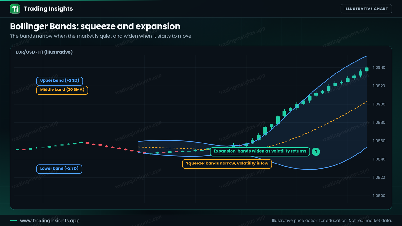
The direction is the hard part. Many traders wait for a candle to close outside one of the bands after a squeeze, and they treat that close as the breakout signal, ideally in the direction of the higher-timeframe trend. Reading the trend first is covered in top-down analysis.
Walking the band: touching is not reversing
The most common beginner mistake is to sell every time price touches the upper band and buy every time it touches the lower band. That can work in a sideways market, but in a strong trend price can ride along the outer band for a long time, which is called walking the band. In that case the upper band is a sign of strength, and the middle band often acts as support during pullbacks.
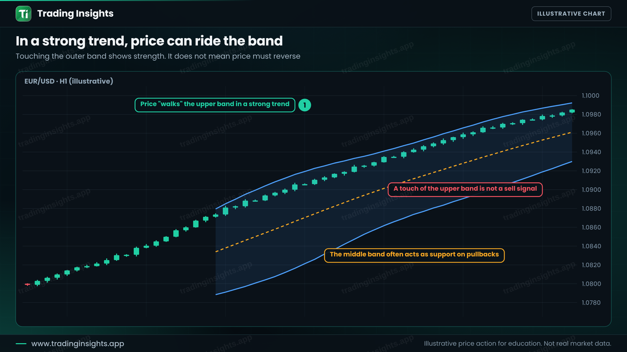
So before you use the bands, decide whether the market is trending or ranging. In a range, the outer bands can mark the edges where a reversal is possible, but you should still wait for confirmation, such as a change of character. In a trend, the middle band is more useful, because pullbacks to it are possible entries in the direction of the trend. You can learn to tell the two apart in what market structure is.
A squeeze breakout trade: worked example
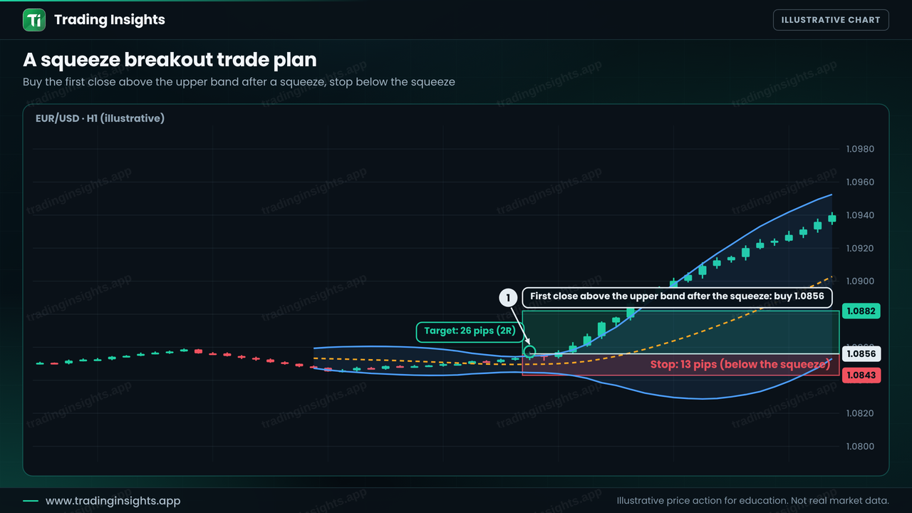
Here is an illustrative plan on EUR/USD, H1. The bands have squeezed for many candles, and then a candle closes above the upper band for the first time. The rules for this example are simple: buy after the first close above the upper band, place the stop below the low of the squeeze, and aim for a reward of twice the risk.